
A new visual identity for the E)HE)SP) French School of Public Health!
From 29 June 2026, the French School of Public Health will gradually implement its new visual identity across all its communications. This development forms part of the application of a strategic institutional plan that positions the E)HE)SP) as a school ‘dedicated to’ training, research and expertise in public health. This visual identity – designed in collaboration with the baldinger•vu-huu studio – comprises a redesigned logo and graphic system that embody a new way of presenting, harmonising and representing the institution. Clarity, openness and a close connection with all its audiences: the school aims to enhance its visibility and accessibility, reflect its public service mission and highlight its contribution to major public health challenges.
 A new logo that clarifies the school’s name
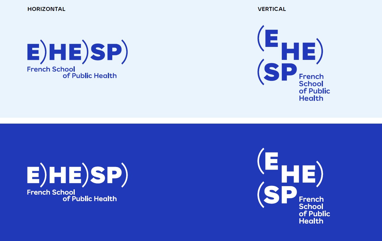
To develop EHESP’s visual identity, the baldinger•vu-huu studio took the dot as its key element. Enlarged and then split into two semicircles, this dot transforms into a set of brackets, thereby revealing the school’s identity in three stages: Ecole) des Hautes Etudes) en Santé Publique), or E)HE)SP).
The school’s full name, displayed horizontally alongside its acronym – either in French or English – now makes it easier to read and more accessible to a wider audience, both in France and internationally.
A graphic system designed as a ‘toolkit’
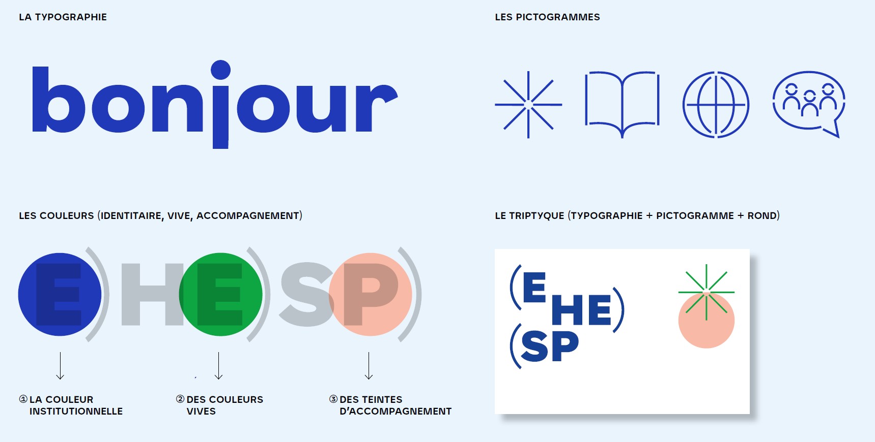
This process of renewing the visual identity goes beyond a simple change of logo. It involves the review of an outdated and incomplete graphic system (the previous logo was created in 2008), thereby enabling the school to present itself consistently across all its media and to all its audiences, and to better embody its values and modernity. To bring this new identity to life, the school now has specific tools at its disposal:
- a dedicated font;
- a set of tailor-made pictograms;
- a brand colour palette;
- monochrome iconography.
A contemporary, minimalist and vibrant visual identity
E)HE)SP)’s new visual identity aims to be minimalist and environmentally responsible: the emphasis on white as a breathing space and the limited use of solid colours have been designed to create a balanced visual impact but also to highlight the content. This understated approach is complemented by a brand identity centred on blue as the institutional colour, alongside vibrant colours that reflect the school’s energy and diversity, and accent colours. This new approach to promoting the school to its current and future audiences will be rolled out gradually over the coming weeks across all its internal and external communications.
Additional information
A specific charter has been drawn up to guide EHESP’s partners in the use of the School’s new logo.
View the Partners’ Graphic Charter (Pdf, 2 MB)